Total Pageviews

Thursday, April 16, 2020

The Last Man Standing - 5/17/2020 update


Please check in from time to time for future graphical updates for the US, Canada, China,  Turkey and Russia, a good representative sample, providing insight into the COVID-19 activity.  The Histogram, shown below, gives an overview for 10 countries, including the foregoing mentioned.

February 4th, I wrote in my blog post, " If one has the cure for it, it can determine the last man standing, so to speak."  China's infection rate of only 3 deaths per million is more than unusually low.

The Daily Infection rate is the best indicator when considering lifting restrictions in place, in my opinion.

Click the charts to enlarge them


China's Daily Infections - As of 4-22-2020
The rate of change for China is so low that updates are more or less of not much use.  China's paradox is simply this, on the one hand they have a low infection rate, while on the other hand their death rate appears to be high.  One could be very skeptical about their reporting.

The recent closure of 21 million cell phone accounts, in China, may indicate a much higher death rate than reported.
https://www.ntd.com/the-closing-of-21-million-cell-phone-accounts-in-china-may-suggest-a-high-ccp-virus-death-toll_447579.html

Status as of 5/17/2020
This Histogram shows data of ten selected countries, including nations with a wide variety of infection severity.  Added is now the percentage of people dying once infected.  The data table, part of the above chart shows the effectiveness in saving lives of the individual countries' medical systems.  This chart is self-explanatory, and you can draw your own conclusions.

 US-As of 5-17-2020
The US Daily Infections curve is finally showing a downward trend, although the forecast line does not agree with that.

As of 5/17/2020
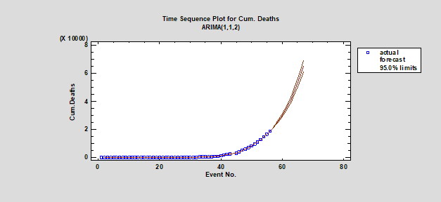
 US Cum. Ratio Deaths to Infections
The Cum. p-Ratio currently indicates that about 6% of the infected lost their battle.  Overall there is no clear trend in either direction; the health care system outcomes have not improved over time.  Looking back, it was far more successful a while back; was it just luck back then?  Something changed dramatically for the worse.

Canada-As of 5-17-2020
Canada's daily infections are starting to show a clear downward trend, as indicated by the forecast line, they must be doing something right.  The people's compliance will do that.


Turkey's-Daily Infections as of 5/17/2020
Turkey, by far, has the clearest downward trend, it is on the right track.  Turkey did just about everything right in a timely manner, the free issue of face masks to all plus restrictions of the very old and young, surely helped them in achieving their goal so far.
 
As of 5/17/2020
Russia has turned the corner for daily infections, however, the forecast line, for some reason, is still pointing up. The near future should give us the answer.


As of 5/17/2020
Russia's death rate of only 0.9% is very low by comparison; it appears, their health care system is in a class of its own, thus far, or are they more imaginative in their reporting, not unlike China?


Note: Raw data taken from:  https://www.worldometers.info 

Note: The above charts and their underlying analyses were aided by the use of Statgraphics' Centurion 18 Statistical analysis software.


Tuesday, April 14, 2020

US Number Of Infections Are About To Reach Apex

As of April 14, 2020, raw data from 'Worldometers' reveal, after statistical analysis, the following  forecasts.
Let us hope we all maintain, or even improve our vigilance.

Click on charts to enlarge them.

US Infections are about to reach apex

US Deaths will continue to increase

US ratio of deaths/infections is leveling

Note:  This study was aided by the use of Statgraphics' Centurion 18 statistical analysis software.

Sunday, April 12, 2020

US And UK Comparison

This comparison is not a competitive exercise but simply a study of two similar initial reactions against the COVID-19 virus.  In each category the US graph will be shown first, and then the corresponding UK graph.  The categories are one, ratio of number of deaths to number of infections; two, number of actual infections and forecast; three, number of actual deaths and forecast.

All graphs represent cumulative data, as seen April 11, 2020.

US Ratio Deaths to Infections

UK Ratio Deaths to Infections
These first P-charts graphs show two different outcomes.  The US graph while showing initially and strong upward trend, managed a robust reduction in deaths, only to start an upward trend again.  This could have been caused by the US health system being overwhelmed locally by the sudden increase in infections.  The UK graph shows a continuous steady upward trend with little fluctuations.  There are no signs that the UK 'NHS' system being strained, at this time.

US Number of Infections

UK Number of Infections
These preceding Infection charts are similar and are different only in numbers of infections, probably due to the difference in the population number.

US Number of Deaths

UK Number of Deaths
The US graph clearly foresees no reversal yet in its forecast, whereas the UK chart forecasts a reduction in deaths in the near future.

To compare apples with apples, in a separate study, as of April 11, 2020, the US shows 62 deaths per million, whereas the UK reveals 159 deaths per million.

Note:  This study was aided by the use of Statgraphics' Centurion 18 statistical analysis software.


Urgent Message To The President Of The US

This message was posted on the White-house web site, April 12, 2020.

"Dear Mr. President,

For a little while now I am analyzing the raw data posted by the John Hopkins University, and that of others, like 'Worldometers.info', and I am extremely concerned about the lack of respect for this pandemic by the public at large.  I am also concerned about the lack of face masks available to the public at a reasonable price.  eBay and Amazon enable price gougers to flourish.  Turkey is providing face masks to the public free of charge, and so should your Government.

I respectfully ask that you and your team look at my statistical reports, published within the last two weeks, as a minimum, and discuss them with your team, to provide corrective actions to stop this virus in its tracks.  Right now we are going the wrong way, up in numbers of infections and deaths, as my studies clearly show."

http://frankjm-socialconcerns.blogspot.com/


I sincerely hope that the office of the President will respond to the needs of the public, and provide protective equipment not only to the medical people, who risk their lives every day but also to the public at large, who at present infect each other, without showing any signs of significant improvement.  Under current conditions these protective items must be supplied free of charge to all.  Unless we are prepared to take drastic measures, we will continue to overwhelm our hospitals in hot spots, and put more medical staff at risk, under such circumstances.   Moreover, we will create new hot spots all over the country.


Saturday, April 11, 2020

What Does It Take?

Click on charts to enlarge them.


Cum. Deaths/Cum Infections
Sample 55 = 4/9/2020
It may be too early to celebrate, however, a change in the growth rate of the number of deaths in the US, may be a glimmer of hope.  The above normalized p-Chart measures the degree to which the US healthcare system is able to handle successfully the COVID-19 virus.

Cumulative Deaths - Actual & Forecast
Event 55 = 4/9/2020

Cumulative Infections - Actual & Forecast
Event 55 = 4/9/2020
This study was aided by the use of Statgraphics' Centurion 18 statistical analysis software.

It appears, unless drastic actions are taken, by all concerned, infections will continue to increase dramatically, which will impact the cumulative number of deaths adversely.  In just the last 7 days the number of infections increased from 259405 to 502876, i.e. nearly doubled.  At that rate it will not take long to hit some real ugly numbers.  The media, as a public service, should place more emphasis on this bleak outlook, to encourage everyone to do their part to avoid infections.  Too many people are still  out and about for non-essential shopping trips, driving by a gardening supplies store, for example,  one can see a full parking lot.

The fact that official sources preached against the wearing of face masks by the public, to hide the fact that very little was, and still is not available at normal prices, too many people are still about unprotected.  People working in grocery stores are mostly unprotected, their management should provide face masks for them, and make their use mandatory.  Face masks offered at eBay, for example, are way overpriced, and according to buyers reviews of poor quality, all of which come from China, it appears.

Looking around, people still take this Corona virus far too lightly, it seems, coupled with the fact that the US Government does not provide face masks, of any kind, for the public as other countries (e.g., like Turkey) do is also not helping.


Thursday, April 9, 2020

If Not In Place - Universal Best Practices Urgently Needed

 
Used: Statgraphics' Centurion 18 statistical analysis software.


The centerline between the red lines is the mean (average) ratio of 0.029 or 29 deaths per 1000.
The chart, shown above, traces the US cumulative ratio of number of deaths divided by the number of confirmed infections.  What does this chart tell us?  In the beginning of the outbreak we had a high death rate, probably because little was known about this COVID-19 virus, and the then current best practices were inadequate.  As days went by and experience was gained, which allowed very bad cases to be successfully resolved.  As more time passed and still more experience was accumulated, the death rate was further reduced.  However, about March 23rd we reached the bottom of the curve, and the death rate was about to increase once more.

One may ask, how is that possible?  What happened?  The not so simple answer is, the system, apparently, became overwhelmed due to the dramatic increase in new infections.  Medical supplies and equipment of all kinds were no longer available in adequate numbers.  The COVID-19 virus infected medical staff in great numbers, instead of adding more medical and support personnel, staff numbers were reduced, as a result.  In addition, working very long hours, the medical staff became less efficient, which is the expected result when overworking people.  Not having adequate protective gear for our doctors and nurses did not help.  The news media highlighted many stories showing that our medical system was inadequate for this pandemic; no doubt, they were right.

It may be that new best practices must established, documented, analyzed and universally distributed to all medical facilities, to allow the use of such by all medical staff, to ensure the maximum successful outcomes for all patients, no matter where they are living.

My advice to anyone tempted to take chances by closely interacting with others in public places, don't do it now, you will probably experience that the service at hospitals, right now, is kind of slow and inadequate, due to staff and supply/equipment shortage.


Wednesday, April 8, 2020

Trending In The Wrong Direction

The chart, shown below, shows that the number of deaths as a fraction of infections is clearly dramatically increasing.  One would think that after some weeks of experience with COVID-19, the data would reflect a downward trend in the number of fatalities, not so.

While the CDC, and others, resists to embrace the use of drugs not specifically designed for this nasty virus, people are dying at an increasing number.  Why is it that other countries have much better outcomes, following infections?  The US claims all along that it has the best medical system in the world, when is it going to live up to its perceived ranking?


Analysis performed by Frank J. using Statgraphics' Centurion 18 statistical analysis software. 

“Another Doctor Reports Dramatic Improvement In COVID-19 Patients Using Trump-Touted Treatment”

“As pro-establishment mouthpieces downplay the efficacy of hydroxychloroquine to treat COVID-19 as "anecdotal" with "little evidence that the treatment is effective," yet another doctor treating has claimed dramatic improvement in coronavirus patients within hours of taking the anti-malaria drug in combination with two other medications.

Los Angeles doctor Anthony Cardillo says he's seen very promising results when the Trump-touted drug is combined with zinc for severely-ill coronavirus patients.

""Every patient I've prescribed it to has been very, very ill and within 8 to 12 hours, they were basically symptom-free," Cardillo told Eyewitness News, adding "So clinically I am seeing a resolution.""

""Cardillo, CEO of Mend Urgent Care, says that the drug must be used in conjunction with Zinc, as the hdroxycholoroquine opens a 'channel' for the mineral to enter cells and prevent the virus from replicating.”"
https://www.zerohedge.com/health/while-left-continues-pan-trump-touted-treatment-another-doctor-reports-dramatic-improvement
Link provided by Dr. John Day


For example, South Korea's death-toll is about 19 deaths per 1000 infections, whereas the US suffers of late (April 6th) 367 deaths per 1000 infections.   Taiwan shows 13 deaths per 1000 infections.  There are others that also fair much better than the US.

What are South Korea and others doing that the US should also be doing, once an infection is identified?

Monday, April 6, 2020

Updated Statistical Analysis Of The COVID-19 Virus Affecting The US

After discovering earlier raw data, about the US, published by 'Worldometer' going back to January 22nd, it prompted a rerun of earlier tests performed to see whether or not COVID-19 stayed on track, as far as a normal distribution is concerned.  These early tests were in essence run with censured data, having had data only as far back as March 6th.

Note:
The following statistical analyses were carried out using the powerful 'Statgraphics 18', statistical analysis software.

To refresh our memory, next are shown the plots from my April 3rd posting.  We saw that the data points tracked the straight line of the normal distribution test.


To make double sure this test was run again, this time with the 95% confidence limits, and it validated the earlier plot, shown above.  Therefore, it was concluded that the data is represented by the Normal Distribution.


Now let us look at the normal probability plot, representing the new data set going back to January 22nd, and we can see that the data no longer tracks the test line of a normal probability plot.  Something has changed.  In my April 3rd post, it said: "One can only hope that the virus will not accelerate but will stabilize, and reduce in number of infections quickly."


The next guess was to test the data set with the exponential distribution in mind, and here is the result, shown below.  It is now evident that on or about March 22nd, the virus infection numbers accelerated significantly, to the point that the data set is now better represented by the exponential function, that is the COVID-19 infections grow now at an exponential rate.  This is not the kind of news one wants to write about.

Based on current data, the prediction limits at the 95% confidence interval now forecast that by April 22nd the true number of infections can be anywhere between 1.84 million and 8.95 million; the prediction is 4.1 million infections for the US, by April 22nd.  At the current death rate of 2.8%, this prediction translates to 1,171,115 million people could be death by April 22nd, unless we drastically change our behavior, and urgent needed medical supplies are provided wherever needed, in a timely manner.


Let us all do our part to make sure this prediction number will be wrong, and the true total of infections by April 22nd will be closer to the low end of the range shown above, i.e. it is within our power to change this current catastrophic trend.

Much of what is shown above equally applies to other countries around the world to a lesser or greater degree, and this warning is indeed valid on global basis.  Therefore, please forward this post to all your families and friends, no matter where they are located because forewarned is forearmed.

My Blog feedback data will show me how serious my readers take this pandemic.  I am confident all of you take this pandemic as serious as I do.  The life we save could our own.


Saturday, April 4, 2020

Without Comment

April 4, 2020 data - Partial raw data source: John Hopkins University.

Analyzed by: Frank J. M.

Friday, April 3, 2020

COVID-19 STATISTICAL ANALYSIS

Unlike most contracted and paid for statistical analyses, I did not torture the data until it confessed  to what I wanted to see as the outcome.

From March 6th through April 1st, 25 US samples were included in the analysis of the daily additions of infected individuals.  The data was then subjected to a Normal Probability Plot to see whether or not it follows a Normal or Gaussian Distribution (my guess), and as the figure below demonstrates, the fit was reasonably good.  The data plotted reasonably close to the straight line, within the 95 percent confidence limits.  This thus demonstrates that the COVID-19 infection acquisition is pretty much a random process; to state the obvious, anybody not isolated can be at risk.

Note: Click on images to enlarge them, or use the ctrl key and the plus key as often as needed.

 This plot was generated  using Statgraphics' 18, statistical analysis software.

The following figure, a Histogram from the same data set, as was used above, and while not a perfect classical symmetric looking Histogram, this analysis did not rule out that it is representative of data with a Normal distribution.  'Skewness' and 'Kurtosis' are well within -2 to +2, see note at bottom left.

This plot was also generated  using Statgraphics' 18, statistical analysis software. 

The next figure is a Time Sequence Plot, which looks, at the moment, anything but exponential, which is at present a  comforting thought.  One can only hope that the virus will not accelerate but will stabilize, and reduce in number of infections quickly.

This plot was also generated  using Statgraphics' 18, statistical analysis software.

At present, I am very hopeful of the eventual outcome, as long as everyone treats all others, not in their household, as an infected individual; yes, at present it pays to be a little paranoid.

I thank the people at Statgraphics for providing me the opportunity to use their latest extremely powerful statistical analysis software, version 18.

I own and have used their DOS version 5.0 for many years, and so have people I made aware of its power, when I was working in the Aircraft and Aerospace industries.  These included figures, shown above, demonstrate only very elementary applications; this software is like statistics on steroids.