Total Pageviews

Sunday, August 30, 2020

COVID-19 - NOBODY DIES IN CHINA ANYMORE

In some of my previous blogs I wondered about China's COVID-19 data; was it for real?  To refresh our memory, I show, below, some of the comments I made going back to March of this year.

"About China, the Histogram, shown below, indicates that China's  death-rate stands at 5.5%.  From April 17, 2020 to July 4, 2020, 79 days, China has added 853 new infections, and if we calculate 5.5% of this number we would expect about 47 additional deaths.  For some unexplained reason or reasons, China reported zero deaths during the aforementioned period; nobody, in China, is dying due to COVID-19 of late.  As a minimum, one has to wonder, how come?

In my earlier blog post of March 2, 2020, I wrote,
"This major virus assault on the populations of this planet appears to go the way some control forest fires go, out of control.  In my humble opinion, no callous scientist would work on a deadly pathogen without having the cure in his or her lab safe.  If this is indeed a developed virus, then logic says somebody has a cure/vaccine for it, which will be very expensive, and above all, a fantastic moneymaker for many."
 
I was wondering then, if China is in possession of the antidote (and vaccine) for this COVID-19 virus; I wonder no more.
 
The following graph, published by "Worldometers.info", is kind of scary; I had never seen before such a mystic chart.

 
https://www.worldometers.info/coronavirus/?utm_campaign=homeAdvegas1?#countries

On or about April 17th China's death toll stood at one moment at 3,342, and then took a major leap to 4,632, adding 1,290 new deaths.  The scary part is, after that event nobody died in China since.  I am not aware of anyone being curious about this highly improbable result.

Is China just lucky, or do they have the best Doctors in the world, or are they withholding vital information that could save many lives, around the world?  One would think their friends at the WHO, would appreciate if China , for once, came clean.  I could be wrong but logic says, as a member of this club, they have an obligation to share their miracles, methods, experience, and drugs they are using, with all other members, through the WHO.

Naturally, after wrecking the economies of the world, save their own, this presents a definite advantage, would it not?  This might explain them holding their cards close to their chest, so to speak, about their treatment tactics for COVID-19 (their own creation most likely).  After all, the U.S. was and still is in an economic war with China, maybe others are too.  Some nations will use any means to win a war; economic wars can become existential, for one or the other side of the conflict, and then nothing may be off the table.
 
 All Graphs/Chart are as of 8-30-2020
Click on the following Chart/Graphs to enlarge them.


The U.S. is reaching almost 30,000 infections in 24 hours, a welcome picture without a doubt.


Canada is stubbornly hovering about the 500 daily infections level; pretty good considering that an economic recovery is underway.


The U.K. is still going the wrong way, and has nearly reached 2,000 infections in 24 hours.


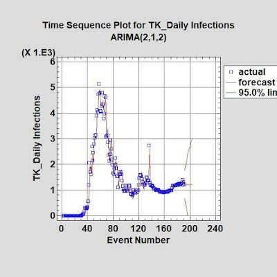
Turkey is definitely in a worsening situation; during the last 40 days it experienced about a 50% increase in daily infections, after meandering about the 1,000 daily infections level for the last 70 days.


Russia is starting to level off, the trend line has a light upward component.  Their death rate is still very low when compared to others.


Please do read the Comment Section, vital information can be found; remember, this is a dynamic situation, and new knowledge is gained frequently.


Note: The above analyses were aided by the use of Statgraphics' Centurion 18 Statistical analysis software.


Sunday, August 23, 2020

Maintaining Infection Levels Is Present Struggle - 8/23/2020 Edition

With the measured opening of country economies, we have to admit that maintaining present infection levels, can be seen as success.  Only Russia is still on an unwavering downward track, while the U.S. appears to have found the descending path again.  Turkey (TK) and Canada are definitely struggling to maintain their current level of infections, while the U.K. is unable to do so.


To enlarge the individual chart just click on it.

 All charts/graphs are as of 8/23/2020


Please do read the Comment Section, vital information can be found; remember, this is a dynamic situation, and new knowledge is gained frequently.


Note: The above analyses were aided by the use of Statgraphics' Centurion 18 Statistical analysis software.

Monday, August 17, 2020

Is COVID-19 Here To Stay?

Many places in the world, right now, are either in a holding pattern, while others are getting much worse; overall things are not improving according to the numbers turned in to the WHO.  Current data strongly suggest that COVID-19 is not going to disappear anytime soon.  Population fatigue is setting in, and as a result facial masks and social distancing are less and less important in the eyes of people all around the world.

World-wide we maintain a little less than 300,000 daily new infections, for the last 22 days.  Moreover, the universal death rate is still 5%; this is way too much.  As shown in the next graph, some countries do better than this, while others do much worse.

 As of 8/16/2020


As of 8/16/2020

The US may find a way downward, unless we are dealing with a reporting error.


As of 8/16/2020


Turkey as of 8/16/2020


As of 8/16/2020


As of 8/16/2020

Russia refuses to go into stall mode, their infection reduction is unwavering.


Please do read the Comment Section, vital information can be found; remember, this is a dynamic situation, and new knowledge is gained frequently.


Note: The above analyses were aided by the use of Statgraphics' Centurion 18 Statistical analysis software.

Saturday, August 15, 2020

"Help Rebuild Beirut, Help Feed the Hungry, Help Draw smiles! "- Organized by Anthony Rahayel

We have all seen the horrific videos of this massive explosion but until we see the effect of it, the enormous range of the severe destruction, it is hard to really phantom the extent of it.  Dr. Anthony Rahayel, who normally is a food blogger (awarded world's best in 2019), when not practicing dentistry, did a great job with his latest videos, showing the world the aftermath of this event.  The following video links will give you a better understanding of this problem.

https://www.youtube.com/watch?v=xFBAQwx9KI8&t=3253s  (I apologize for the political add embedded into this video, neither Anthony nor I had any say in the matter.)

https://www.youtube.com/watch?v=jNKMOb2BVFM

Anthony has setup a website allowing anyone to "Chip In", as best they can, using PayPal to send the money, free of any charges.  Below is the link to his web donation page.

https://www.paypal.com/pools/c/8rsuZztQU6

Why did I select Anthony Rahayel for handling our (wife and I) donation?  For one, he truly loves Lebanon and its people, being from Lebanon himself.  We watched his Youtube videos for a number of years, and we got to know his character; we respect him very much.


Dr. Anthony Rahayel

Ordinarily, I do not become involved in fundraising of any kind but this is truly a special case, whereby Lebanon has extra ordinary financial problems; the Lebanese pound lost 86% against the US dollar. Their Politicians are corrupt to say the least; even the IMF will not touch them.  Lebanon, like other countries, struggles with COVID-19, and to add insult to injury, a major portion of Beirut got virtually demolished.  How can anyone ignore their plight?


Monday, August 10, 2020

COVID-19 - Looking Also At Graphs Showing Death Rates

Usually, I only showed an Excel Graph depicting the Cumulative Death Rates for the country sample I selected, among other characteristics, however, it does not demonstrate any trends.  To correct this shortcoming, I decided to provide this vital statistic again, showing the rates from the early onset to the present, by the use of p-charts.  As such, I will show the individual p-chart before the corresponding daily infection charts, without any particular ranking.  The fact that not all of the underlying chart data are normalized, direct comparisons to other countries is not possible.

Blogspot, the host of my blog, came out with a new update, and as usual things don't always work the way the used to, accordingly, the format is off in places, where it should be centered, it is not.

To enlarge the individual chart just click on it.


8-9-2020 Snapshot of my sample of countries


 The US showed a clear reduction in deaths but may stall at just about 3%.


 The US daily infections are coming down the forecast line indicates.


 Canada's Death Rate is finally showing a downward trend.


 Canada's daily infections are stalled, and are somewhat erratic.


Turkey's Death Rate maxed out pretty low from the early stages, and is still slowly coming down.


 Turkey's Daily Infections refuse to stay below the 1,000 level.


 UK's Death Rate, while consistently below a poor 16 %, for some time, shows only minimal improvement.


 UK's Daily Infections are in a distinct upward trend.


 Russia's low Death Rate of 1.6% may be leveling off, says the trend line.


 Russia's Daily Infections over the last 60 days never wavered on its way down, it is by far the best reduction performance, in my sample.


Please do read the Comment Section, vital information can be found; remember, this is a dynamic situation, and new knowledge is gained frequently.


Note: The above analyses were aided by the use of Statgraphics' Centurion 18 Statistical analysis software.


Sunday, August 2, 2020

COVID-19 Graphs ... Without Comment - August 2, 2020

Since a picture is more worth than a 1000 words, I elected to live by this adage.

Do click the Graphs to enlarge them.


As of 8/2/2020
Normalized data invites comparison

The next Graphs are in no particular order.


U.S. - As of 8/2/2020


Canada - As of 8/2/2020


Turkey - 8/2/2020


Russia - As of 8/2/2020


U.K. - As of 8/2/2020


Please do read the Comment Section, vital information can be found; remember, this is a dynamic situation, and new knowledge is gained frequently.


Note: The above analyses were aided by the use of Statgraphics' Centurion 18 Statistical analysis software.